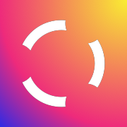
The CommonLounge Logo
One of the things I fondly remember from 2016 is coming up with the CommonLounge logo. I had been a long-time subscriber of the Brand New Weekly newsletter at the time. I knew that there are folks out there who work on logo design and brand identity and take the task quite seriously. I aspired to come up with something that, one day, might get their begrudging approval.
I wanted to doodle up something that remotely resembled the letters "CL", was a unique shape, and could easily adapt to multiple light/dark backgrounds. This was my first foray into any sort of logo design work, and this is what I came up with:

The left half resembled a broken capital "C", and the right half resembled a lowercase "L". I know it's quite a stretch to imagine that, but I was happy with it. It was just a simple, symmetric shape that I could see getting used everywhere: app icons, splash pages, site ID on the headers, business cards, letterheads, etc.
I kept tinkering and having fun with it over time. Once, I tried to animate the negative space circles (there are three of them) to make them expand from the center. I wasn't too happy with the result, but was glad that I was able to squeeze out something that could potentially be polished and used as a custom loader one day:
When Instagram splashed up their own logo with rainbow colors, I tried out a version for us to better fit into the zeitgeist.

Being an engineer, I'm glad I got to think about brand identity and logo design at some point. I'd say, this is one of the best perks of working at or founding a startup. One day you can be knee deep in the code, decide to take a break to doodle up a few logo concepts, realize you may be getting somewhere, open up Sketch, and an hour later, have a new identity for your company.
It's magical!